
Wrong Speed
A record label. Music, 2026.
This page is a deck. Drag the record round, push the pitch, switch 33 to 45, or stop it. Everything follows your hand.
The one idea
A two-person label in Bristol that presses dance records meant to be played at 33 or 45, whichever the DJ prefers. Both are correct. Neither is printed on the label.
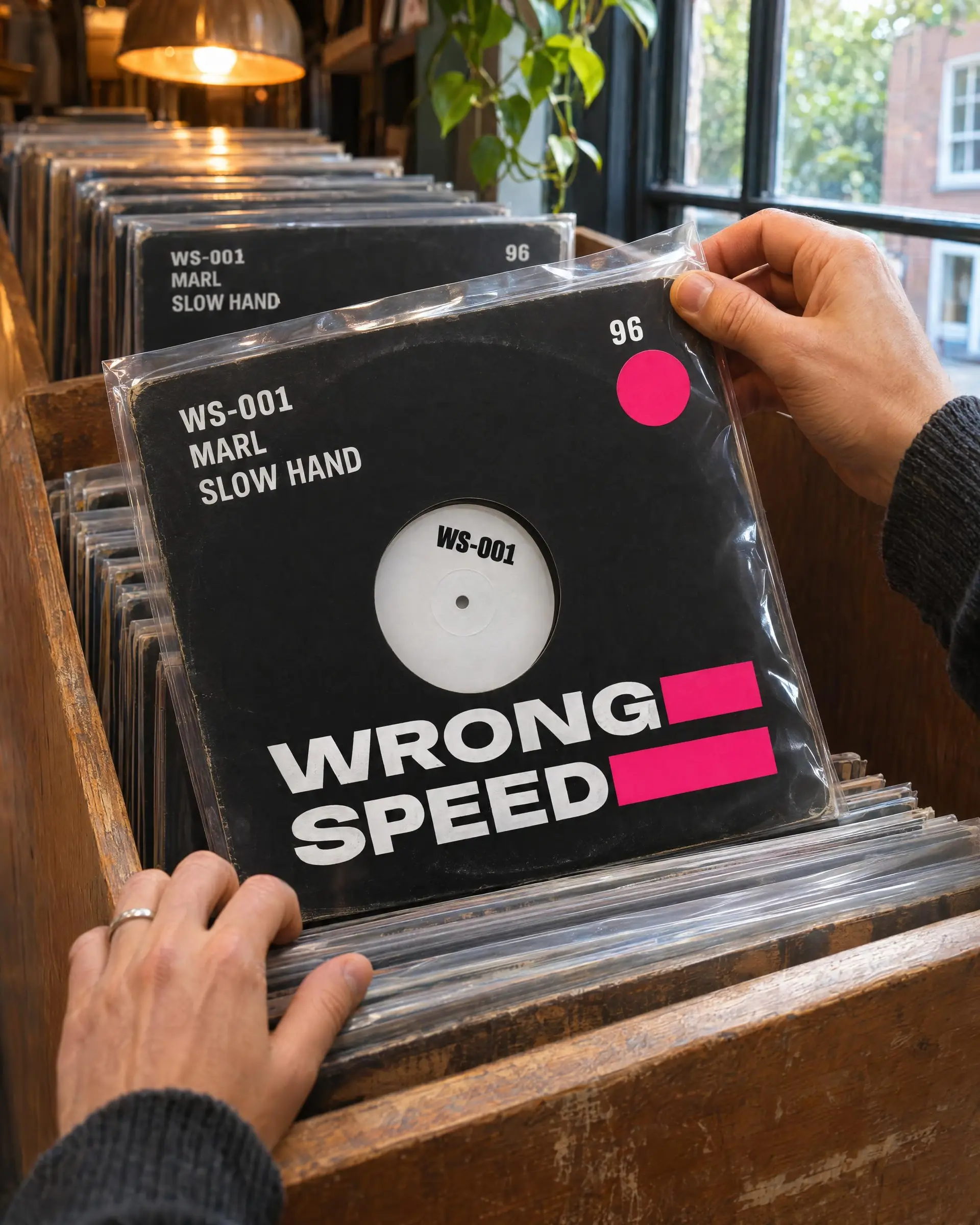
The lettering stretches when a record is slowed down and squeezes when it is sped up. No two sleeves are the same width.
- Client
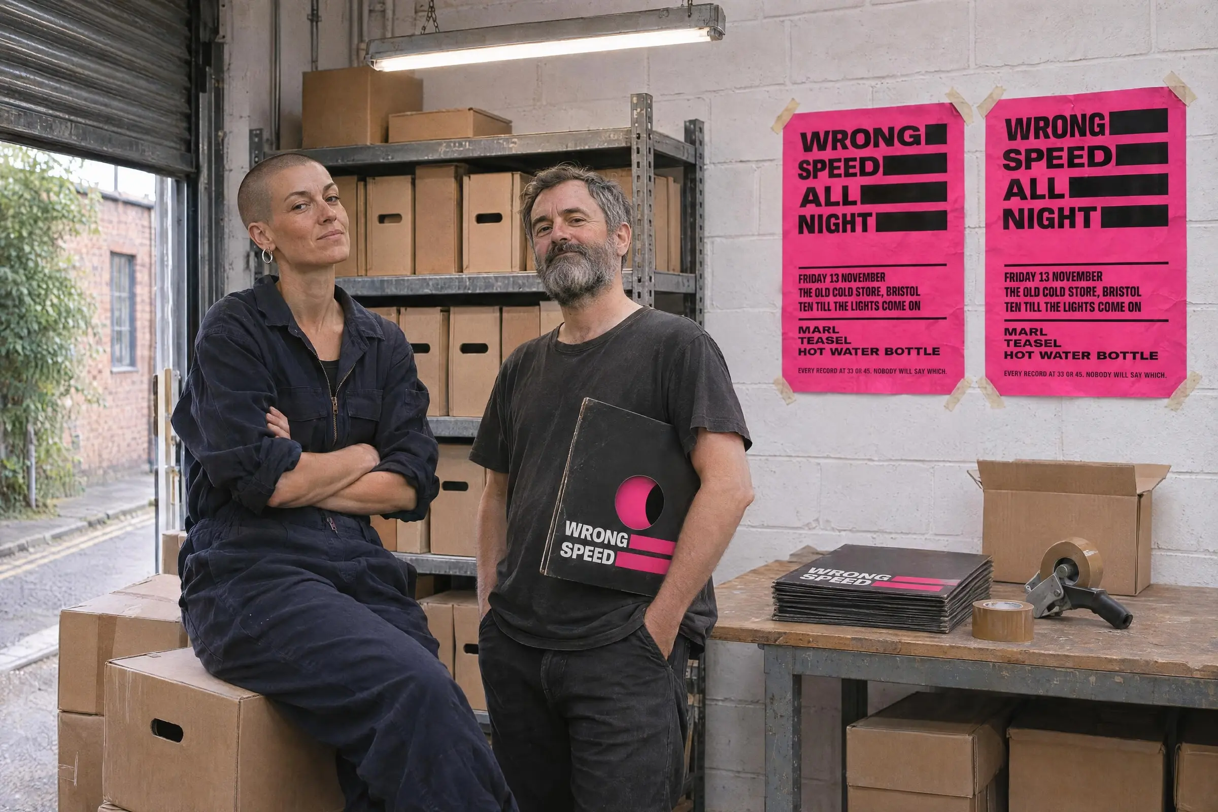
- Wrong Speed: Jules Abara and Dev Mistry, Bristol
- Brief
- A label people can spot from across a shop, made by two people with a day job each
- We made
- The naming rule, five sleeves, center labels, posters, a sticker, the pressing order and a four-page rule book
- Time
- Nine weeks, three of them arguing
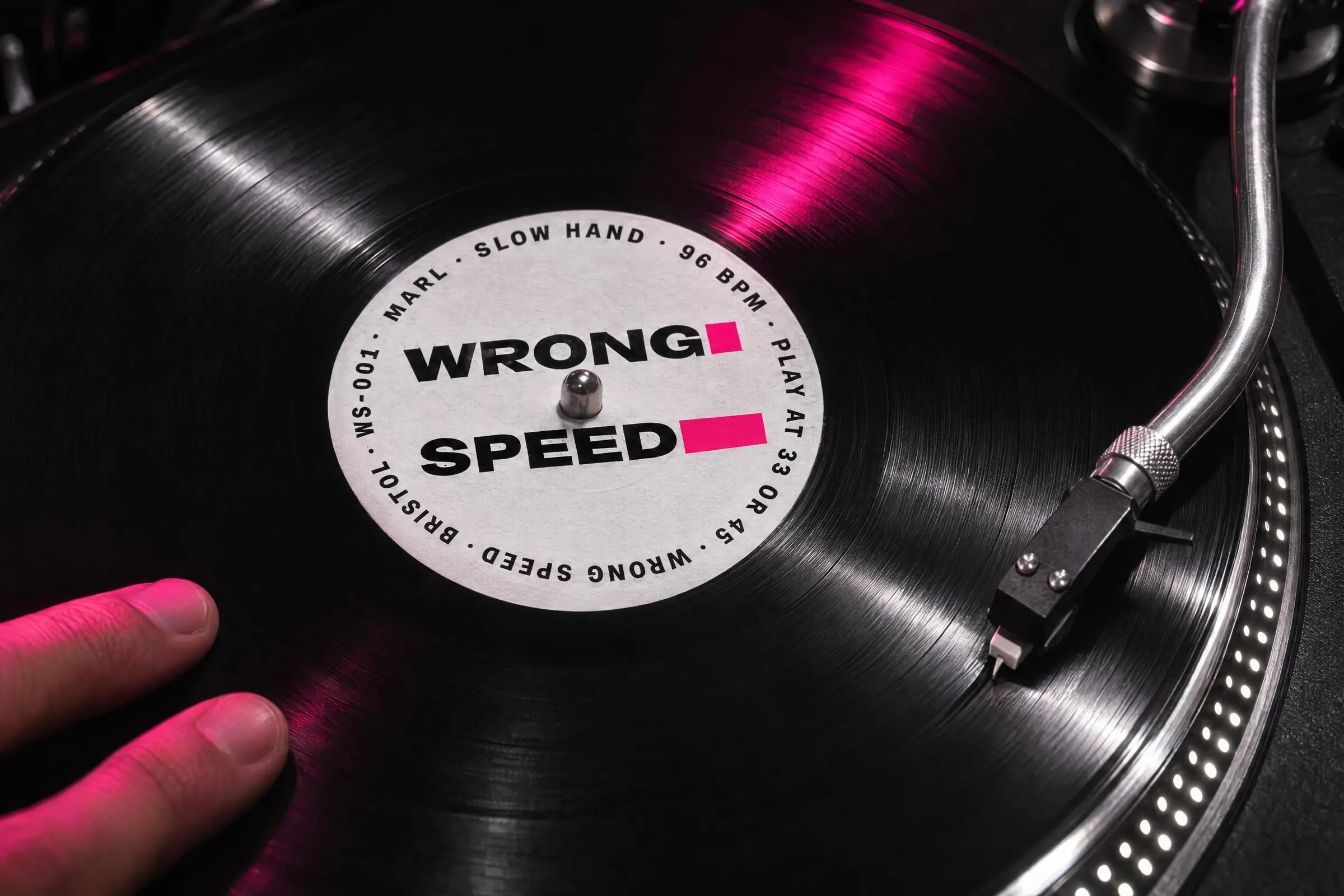

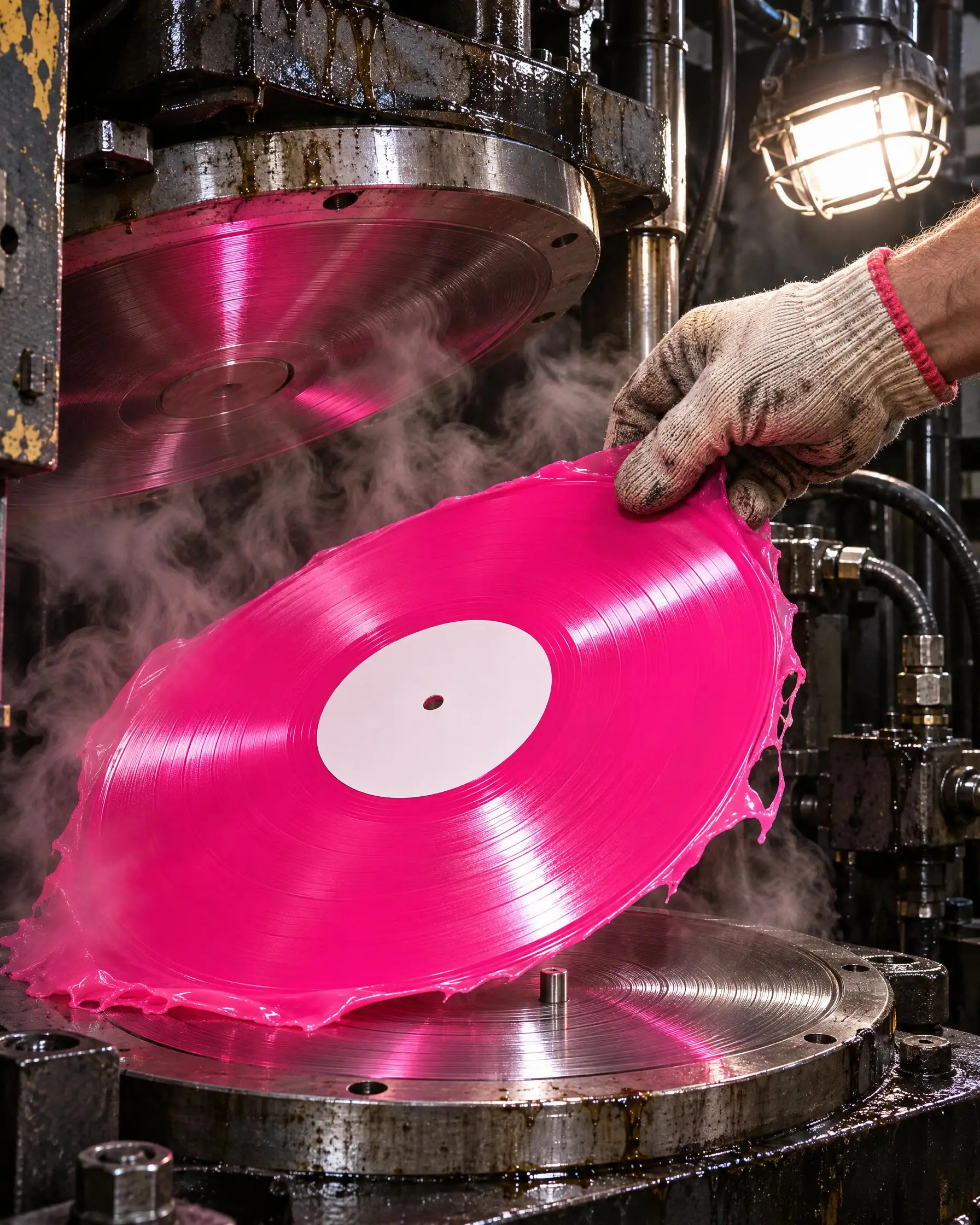
A booth, a basement, a press. The pictures take their widths from the tempo as well.
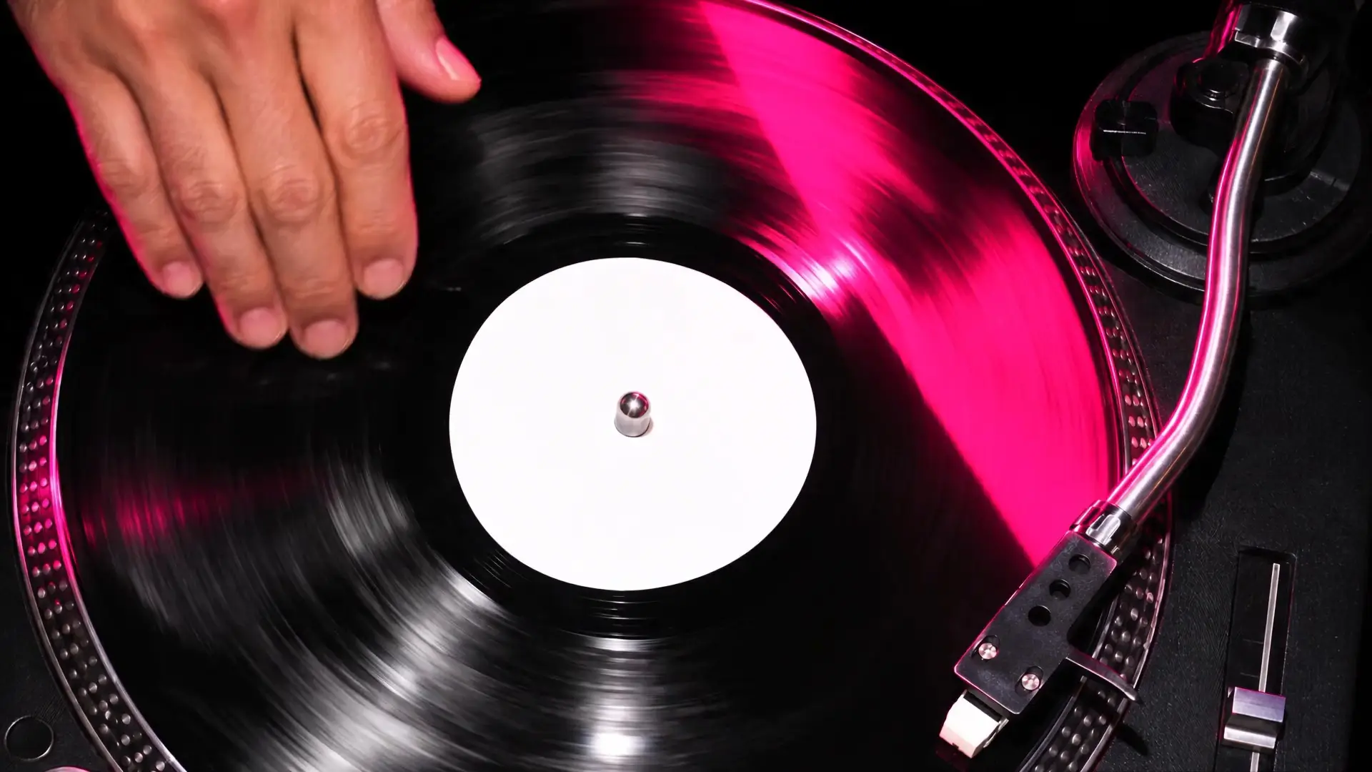
The film is five seconds long at 45. It plays at whatever speed the deck is doing, so it is rarely five.
No logo. Four rules, and one thing that stays put.
The mark
The name has no fixed shape. Its width is set by the tempo of whatever it is printed on: 96 beats a minute is wide and lazy, 140 is tight.
118 beats a minute, so the name is 94 wide. That is Stairs.
The type
Anybody, one typeface that goes from very narrow to very wide. We use all of it.
Point atTouch a letter. It takes the room and the rest give it up.
The color
Black, white-label white, and one pink that hurts slightly.
It is the one thing the pressing plant can check.
- Acetate#0C0C0C
- White label#FFFFFF
- Run-out#B9BCC2
- Test press#FFE94A
The motion
Everything runs a little too slow or a little too fast, then corrects itself, like a hand on the platter.
The dots on the rim of a deck. They stand still when the speed is right, and drift when it is not.
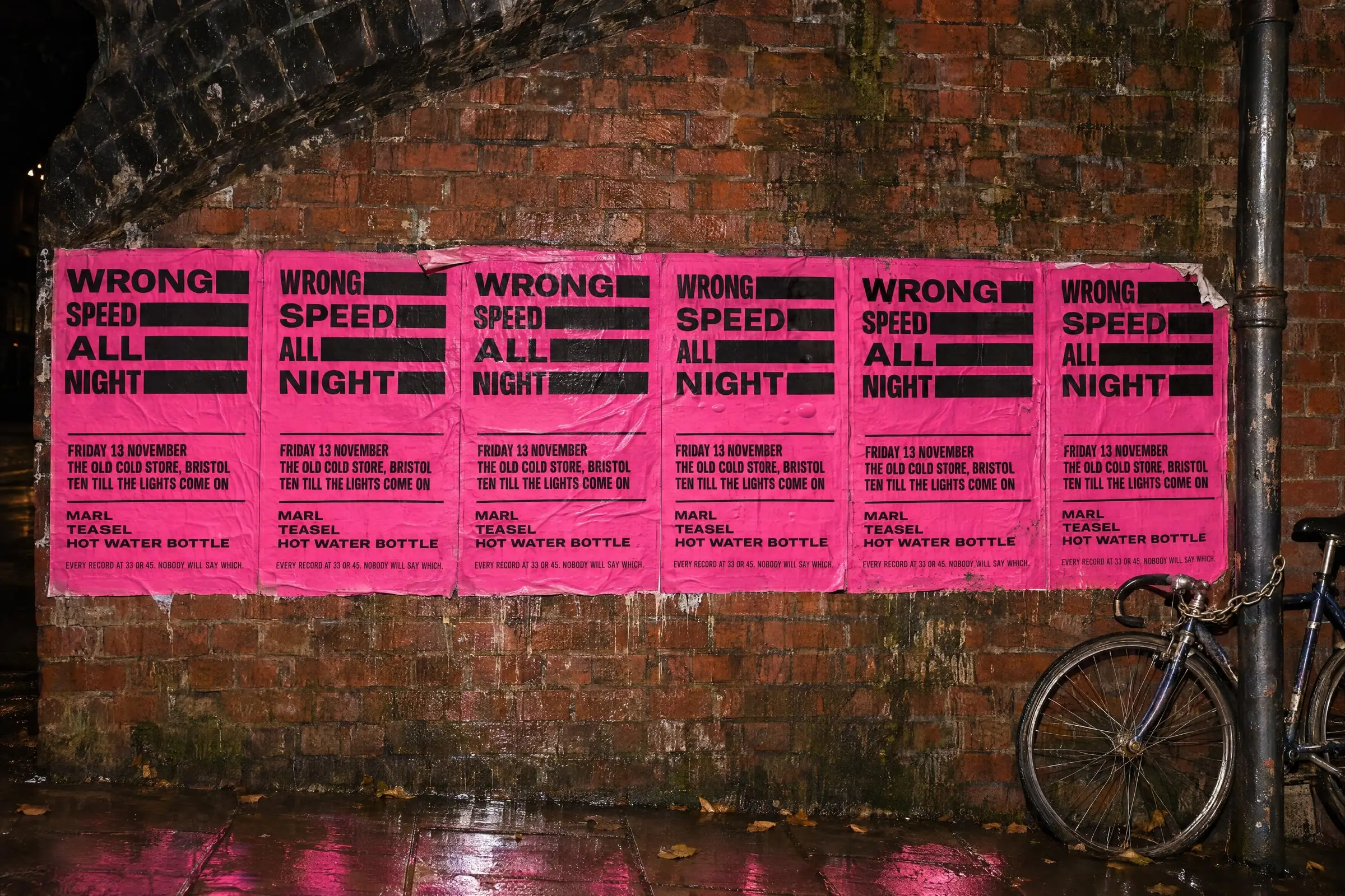
What goes out of the door.

Wrong
Speed
All
Night
Friday 13 November
The Old Cold Store, Bristol
Ten till the lights come on
Marl
Teasel
Hot Water Bottle
Every record at 33 or 45. Nobody will say which.

Pressing order
- Speed
- 33 or 45. Print neither.
- Logo
- Varies. Today it is 131 wide.
- Sleeve
- Varies. See logo.
- Side A runs
- 8:22, depending who is playing it.
- Pink
- Pantone 213 C. #FF2E88. Fixed.
Checked against the pink only. J.

1 of 4
Width
The slower the record, the wider the name. Read the tempo off the test pressing, not off the email.
2 of 4
The pink
- Pantone 213 C
- Screen
- #FF2E88
- Vinyl
- Opaque pink, matched to a printed chip
It is the only thing that does not move. Check everything else against it.
3 of 4
Speed
3345
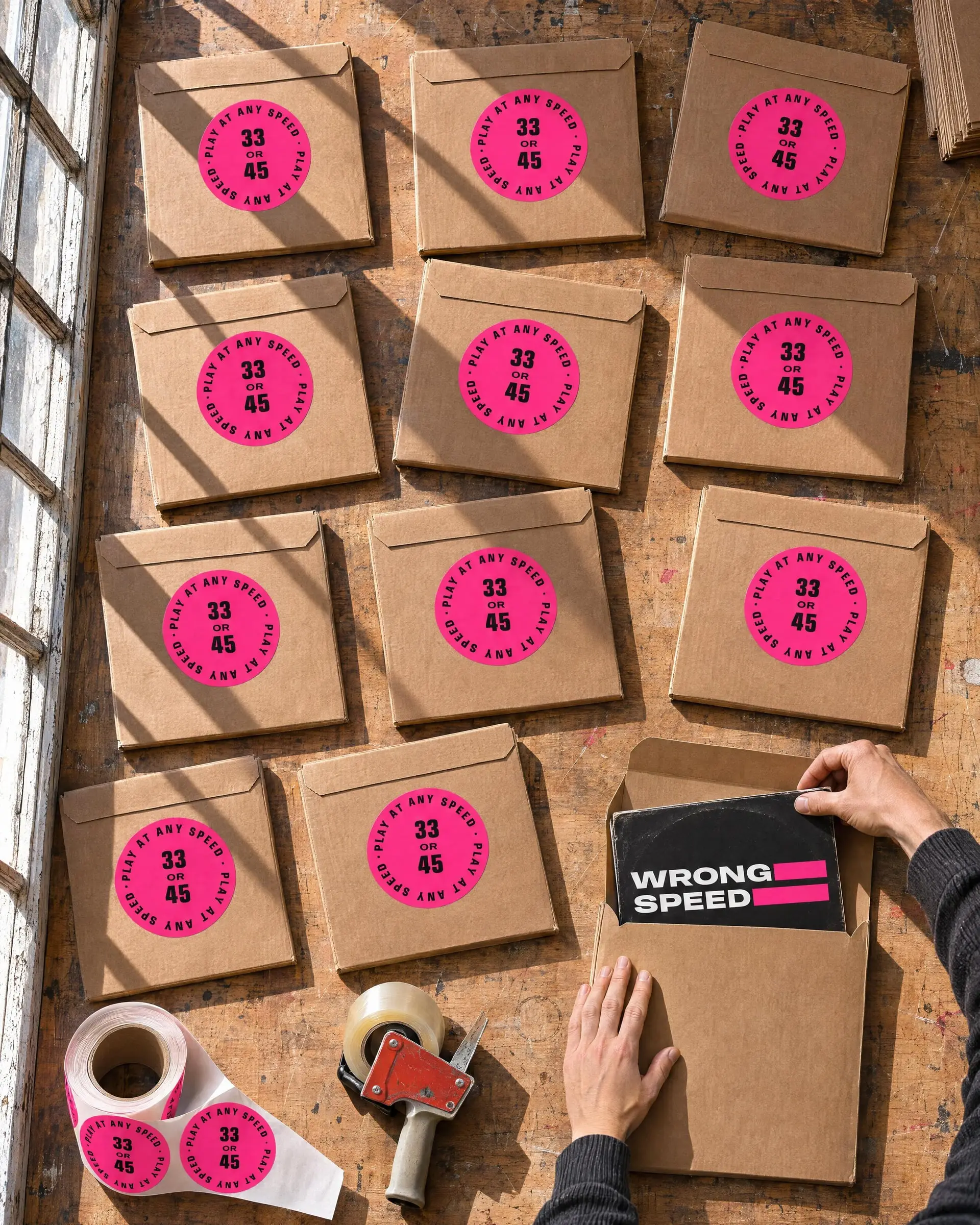
Both are correct. Print neither, on the label, the sleeve or the listing. If a shop asks, send the sticker.
4 of 4
Do not
- Wrong SpeedFix the width
- Wrong SpeedTidy it into a logo
- Wrong SpeedUse a second colour
Everything not on this page is allowed.
We proposed. Jules decided.
At one end of the line, a label any record shop would stock. At the other, a name that will not hold one width.
We proposed
A label that could sit on the shelf of a big record shop without frightening anyone. One width, one neat logo, pink as an accent.
Jules argued
“If it sits comfortably anywhere, it isn’t ours. The whole point is that it sounds wrong until it sounds right.”
Jules decided
No fixed logo at all. We argued for one fixed thing, so the pressing plant had something to check against, and won that much: the pink never changes.
The first three releases sold out. The pressing plant has asked them, politely, to pick a width.
Set in Anybody, an open typeface from Etcetera Type Company, used at every width it has. Pink: Pantone 213 C. Printed and pressed in Bristol.